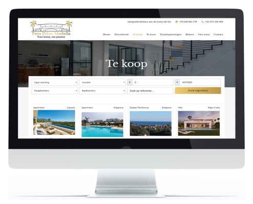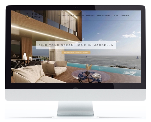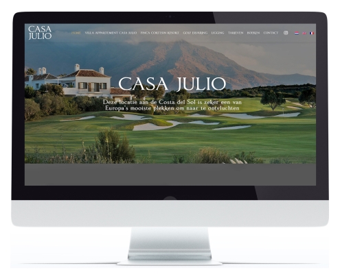









Each project includes a preliminary orientation conversation. This explores and translates your wishes and needs into a web strategy. Together with you, we create the structure of the website.
This will immediately indicate the size of your website and you will also know the price tag. No unpleasant surprise afterwards!

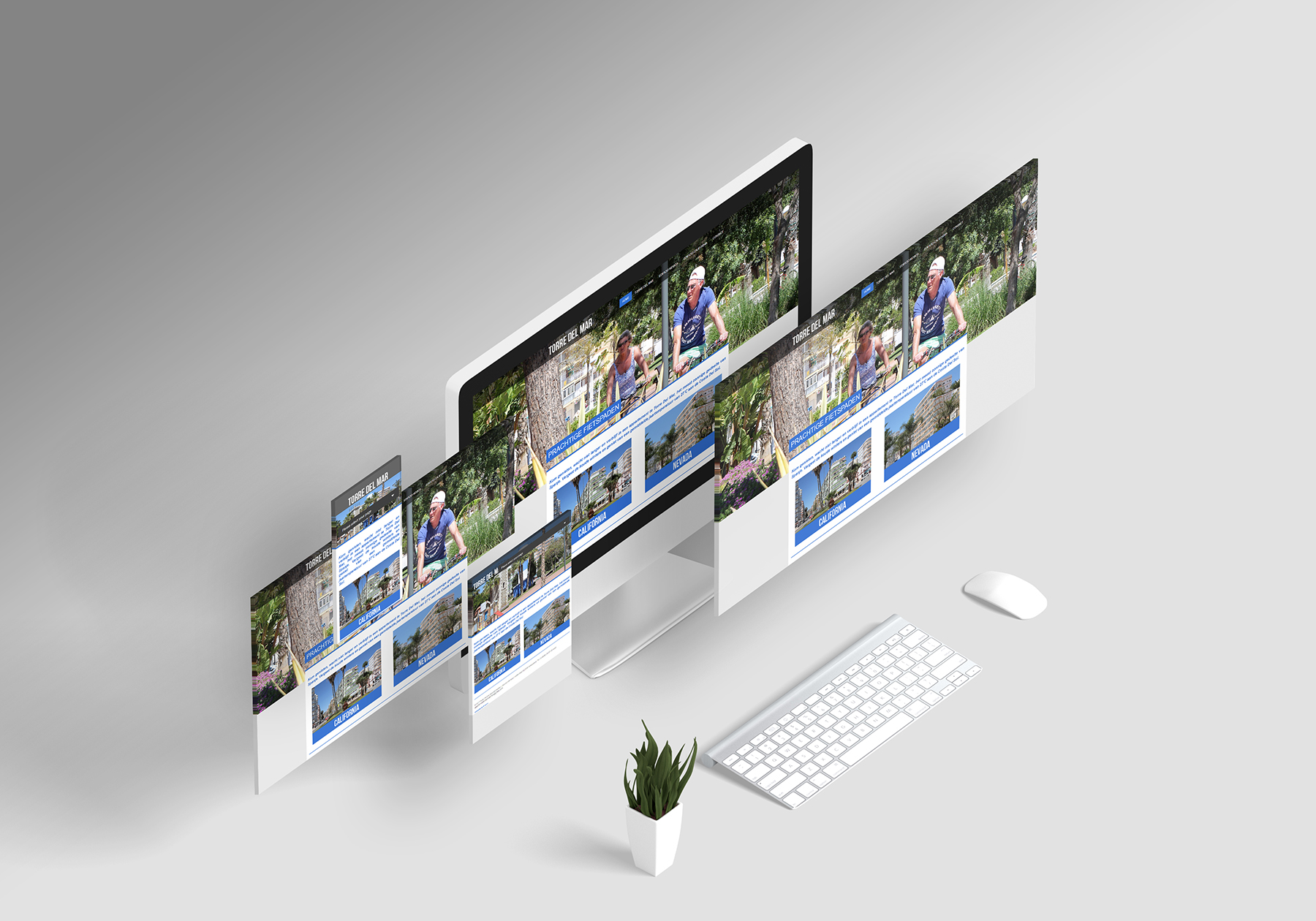

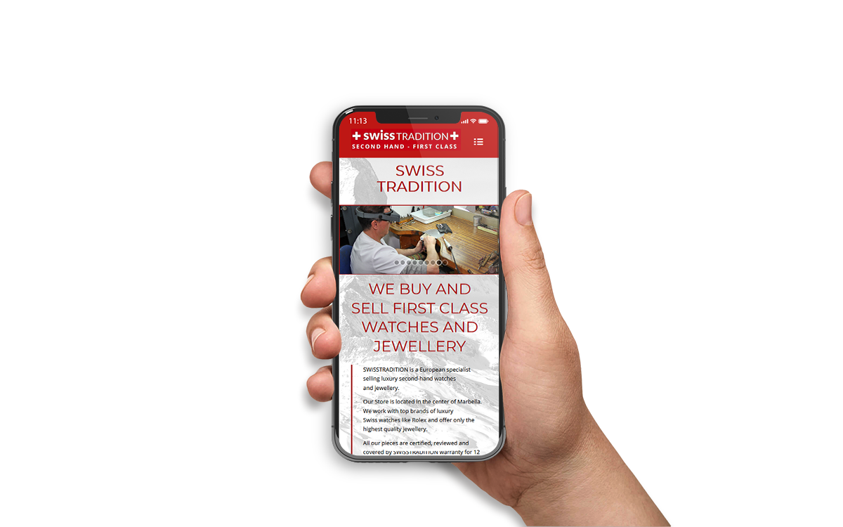
Websites are more often consulted on mobile devices such as smartphones and tablets. As a result, they should appear correctly on those devices.
In short, a Responsive website automatically adjusts when screen resolution (screen size) changes. The major advantage of this is that your website is perfectly legible on both a smartphone and tablet, as well as on a ‘normal’ screen.
Design your responsive website with ProCor and give users a better experience!
